COMMUNITY APP REFRESH PT.1
Pushpay's Community App is a white-label product that helps churches engage with their communities through sermons, podcasts, events, devotionals, music, notes and giving.
Company: Pushpay (Apps Team)
Roles: user research / co-design workshop / prototype / lead interaction & UI design / user testing
The design method
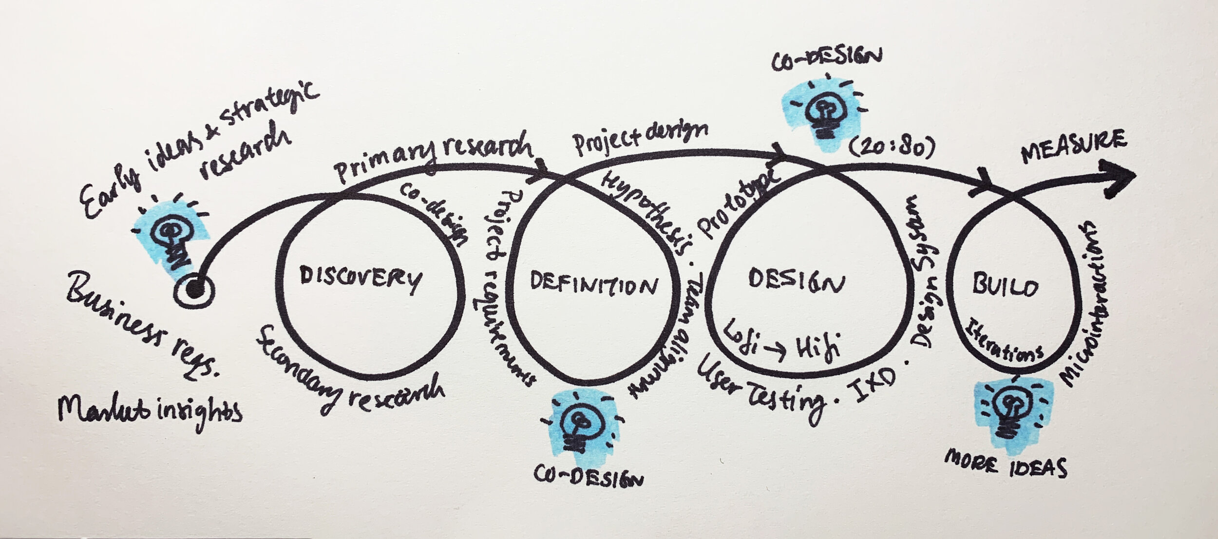
We used Lean UX methodology that consisted of five phases: Discovery, Definition, Design, Build and Measure. The emphasis was on iterative design from lo-fi to hi-fi with continuous collaboration between team members throughout the product cycle. The team included UX Designers, Product Managers, Engineers, Data Scientists and Business Stakeholders.


understanding the modern church
In order to solve the right problems, I needed to understand the modern church space and congregations. I did this by surveying and interviewing church content creators, leaders and members. Then I followed this up with desk research, app analytics and small ethnographic research initiatives (at sites).
My research findings corresponded to an earlier research around engagement whereby church members would go through different phases in their spiritual journey, as well as the differences in church membership or culture depending on their locations and the communities they served. The app’s homescreen needed to reflect and accommodate these differences.
Problem statement & hypothesis
Based on the research synthesis I formulated the biggest common pain point for church members in the following problem statement and design hypothesis:
How might we engage church members through their community apps so that they feel connected to their church early and meaningfully?
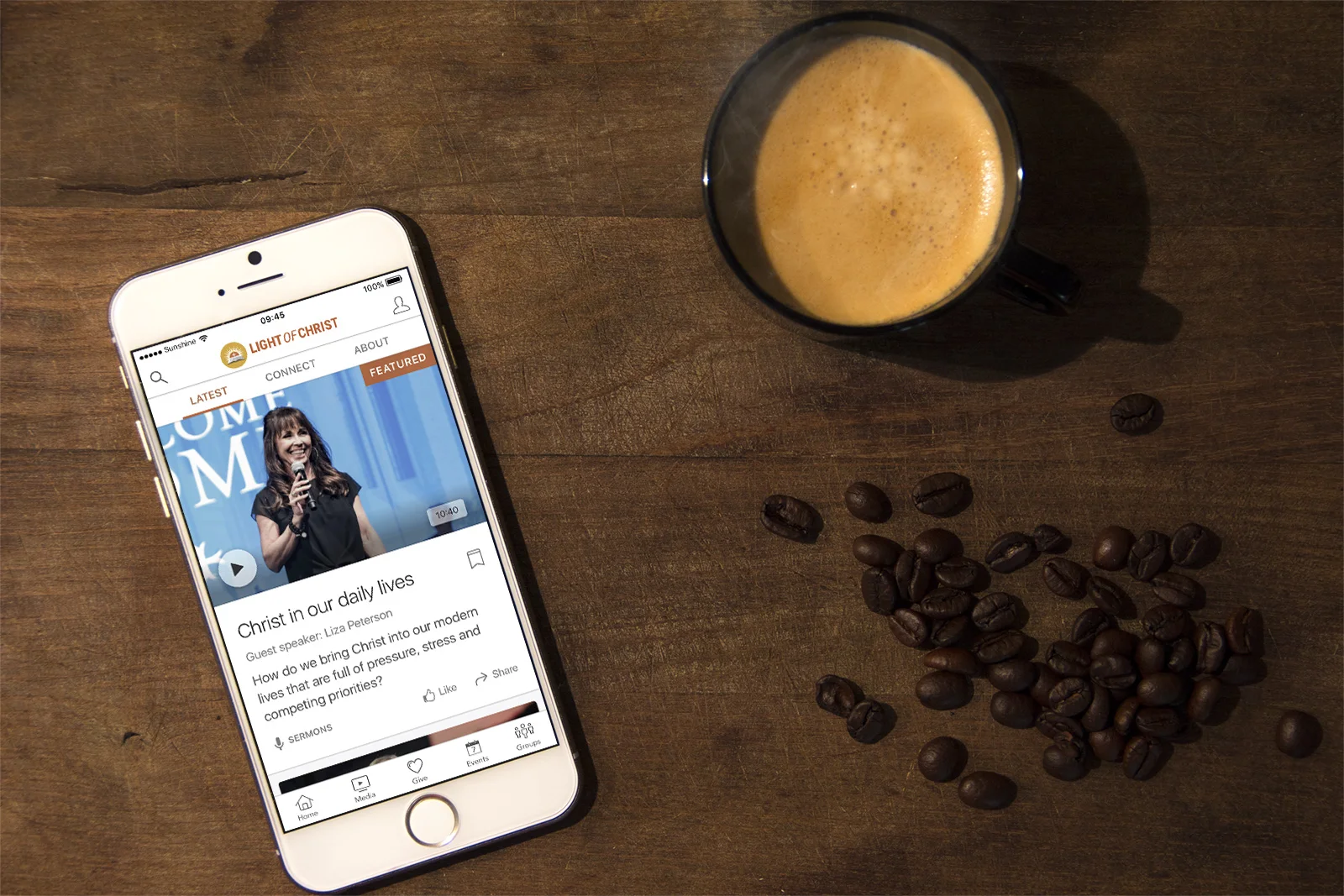
The original homescreen design before I worked on the project.
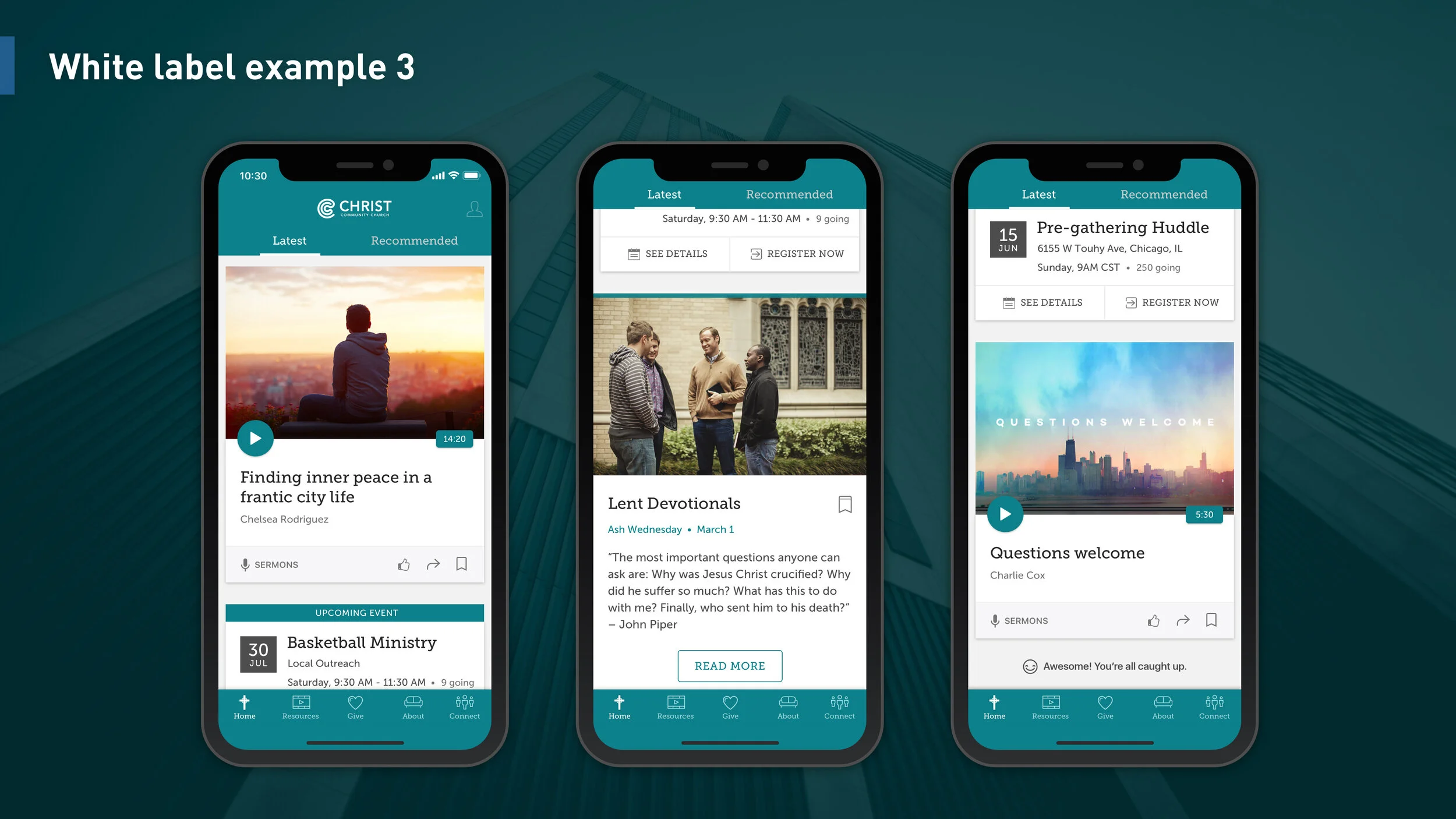
Examples of the new homescreen experience (with faux church brands).
Design Hypothesis
By replacing the static home screen (first image) with a dynamic experience (second image) church members can stay up to date and see relevant content so they could remain engaged with their church.
This hypothesis paralleled a common feature of social media, which were popular amongst user groups.
I planned and facilitated different cross-functional teams through co-design sessions to generate ideas and to get alignment on the problem space. The lo-fi concepts helped developers and product managers to plan their own activities.
prototyping & user testing
The consolidated homescreen ideas were converted into a clickable lo-fi prototype, then tested with a dozen stakeholders and actual church app users remotely because Pushpay customers and end users were predominantly based in the US.
Hi-fi design
After each round of user testing I’d increase the design fidelity while taking regular feedback from designers, product managers and engineers. The hi-fi design would gradually take shape with a fresh new look that was also customisable to support different churches’ brand identities.


The following are some examples of how different churches can customise the look of their community apps. Note: due to confidentiality the following examples are based on fictional churches only.
The Dynamic Homescreen promotional video
One of the things that I love about the product world is that all the different teams in the company collaborated together with a single focus to craft, test and promote that shared vision. Below is one of the promotional videos that were created by the Product and Customer Success teams. The design specifications I created were integral to the video production and feature releases.
measure & iterate
The Product, Engineering & CS Teams measured the adoption rate and took direct feedback from users and customers so they could prioritize improvements in the next iteration cycles. For the app design team, we continued our work in optimising the rest of the app experience with the Secondary Screens & Profile redesign.


