Watercare Dam Levels Redesign 2020
Redesigning the dam levels page, one of the key digital touch points during Auckland’s severe droughts in 2019/20, in order to inform the public about our water supply, consumption, Watercare’s restriction policies and droughts response.
Client: Watercare (Digital)
Roles: design & content strategy / co-design / interaction & UI design / design system
Background
From late 2019 onwards Auckland faced its most severe droughts since 1993/94 according to NIWA, with water restrictions put in place by Watercare from May to October 2020. The restrictions significantly affected residents and local businesses – resulting in financial and mental strains, amidst the Covid-19 lockdowns.
The project’s Challenges & goals
The situation posed an immense challenge for Watercare’s Communications department. So the Digital Team was tasked to find ways to increase Watercare's customer satisfaction, help restore the company’s brand value and improve its communication effectiveness with the public.
We were to support a larger communication strategy where Aucklanders would be well informed about the 2019/20 droughts, the water restriction policies, and the reasons behind them. We then measured this through surveys, while aiming for a reduction in customer complaints and queries regarding those topics. Due to project constraints, my team focused its efforts mostly on the Dam Levels page redesign.
The Audience
We understood that there were two primary audiences for this page: general public (ie. residential and commercial water consumers) and technical viewers (ie. people who analyse water statistics for their academic or scientific research). The Digital Team would focus on the first group, while the commercial customers would be informed through direct channels.
Copywriting
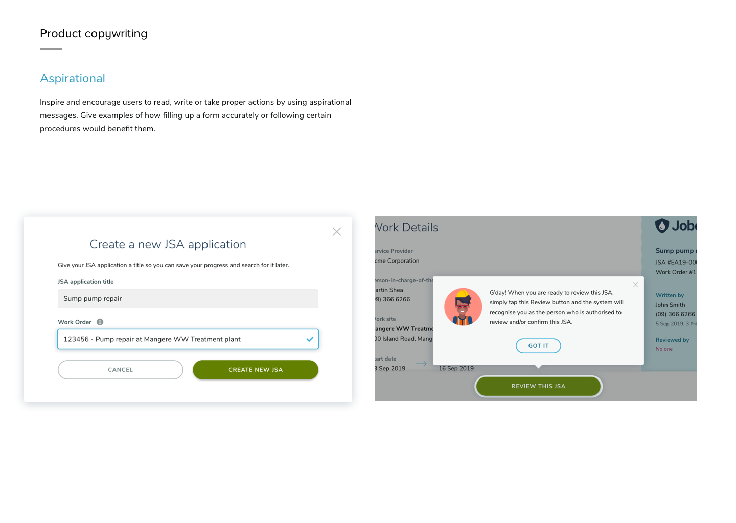
Because these audience groups had different goals and mental models, we carefully considered the copywriting so that information was more accessible to the larger general public (over the smaller academic researchers). We compared different measuring units, label and toggle names, while minimising technical jargons. My role was to help reconcile the differing visions between the Communications and Engineering teams. To that end, we came up with a simple content guideline that we documented on Confluene and shared through Slack and email to the stakeholders.
Problem Statement
The assumptive problem statement was:
“We believe media criticism of Watercare is partly due to its water restriction policies against what is perceived as Auckland having enough water supply. There is also an opinion that Watercare has not done enough to prepare for the droughts, nor respond to it adequately. This makes it harder to encourage water saving habit for Aucklanders, justify the water restrictions and securing more investment in water infrastructure."
The Design Process
We hypothesised that the Auckland’s Dam Levels page would track a lot of traffic during the droughts period, and it would be one of the main digital touch points for the public and news media. However, we identified that key information in the original Auckland’s Dam Levels page was either missing or not well presented.
Key Design Issues
• The chart that compares our dams’ water supplies was not in scale to the proportion of their volumetric sizes.
• There was a factual inaccuracy such as the Hays Creek Dam, which was not connected to the water networks at the time, being shown as active.
• The page’s visual design looked outdated and the content was not easy to interpret.
• Poor mobile reading experience.
• The page was also disconnected from the larger water saving campaigns and stories that were published in other touch points, such as the Water for Life website.
I conducted brainstorming sessions with the Voice of Customer, Infrastructure Engineering, Brand and Digital teams to generate layout ideas, a new Information Architecture and a simple content guideline. The strategy was to connect & surface relevant information that were scattered across different websites and pages via the Auckland’s Dam Levels page — so we could inform the public about why we were in the thick of the water crisis, what Watercare’s droughts response was and how Aucklanders could contribute to the efforts.
The new design
The team agreed that we needed to present data in a visually pleasing manner, make them timely and easy to interpret. So we redesigned the entire Dam Levels page from the ground up to display an interconnected stories about our water supplies and usage.
The new design consists of five related sections:
The Dams and their water levels
Recent rainfall data
Auckland’s water consumption trends
Where Auckland gets its water from
The drought initiatives
SECTION 1
The most important data is positioned at the top: how much water Auckland has at any given day, followed by web cam footages of larger dams, and three different views of the dam levels in the scale of each other, including a time series.
SECTION 2
In the design concept, the team believed that showing how much rainfall Auckland received in the Waitākere and Hūnua Ranges could help explain why the location of the rain was as crucial as how much rain we actually got. This was one of the reasons we didn’t have enough water despite some rainy days.
Section 3
Section 3 was where a viewer could make sense why our water situation was dire, as Auckland’s water supply could not match the consumption volumes and rates. The insight box in each section would provide clear interpreation of data, which rationalised things like the water restrictions.
SECTION 4 & 5
The last two sections would display relevant bite-size information that could be swapped or updated as necessary. It was important to raise awareness of what other water resources we used beside the dams, and the drought initiatives.
From sketch to hi-fi mock up
In terms of visual design: I used ample spaces with bold imagery and adaptive charts to modernize the look & feel. The layout was based on an annual report aesthetics that can cater for statistics and short-form text. Each section was designed to be modular so they can be easily swapped or removed. As benchmarks, we looked at a number of websites in particular the inspirational Auckland Water Supply website by Ben Colgate, and the terrific Wellington Water supply page.
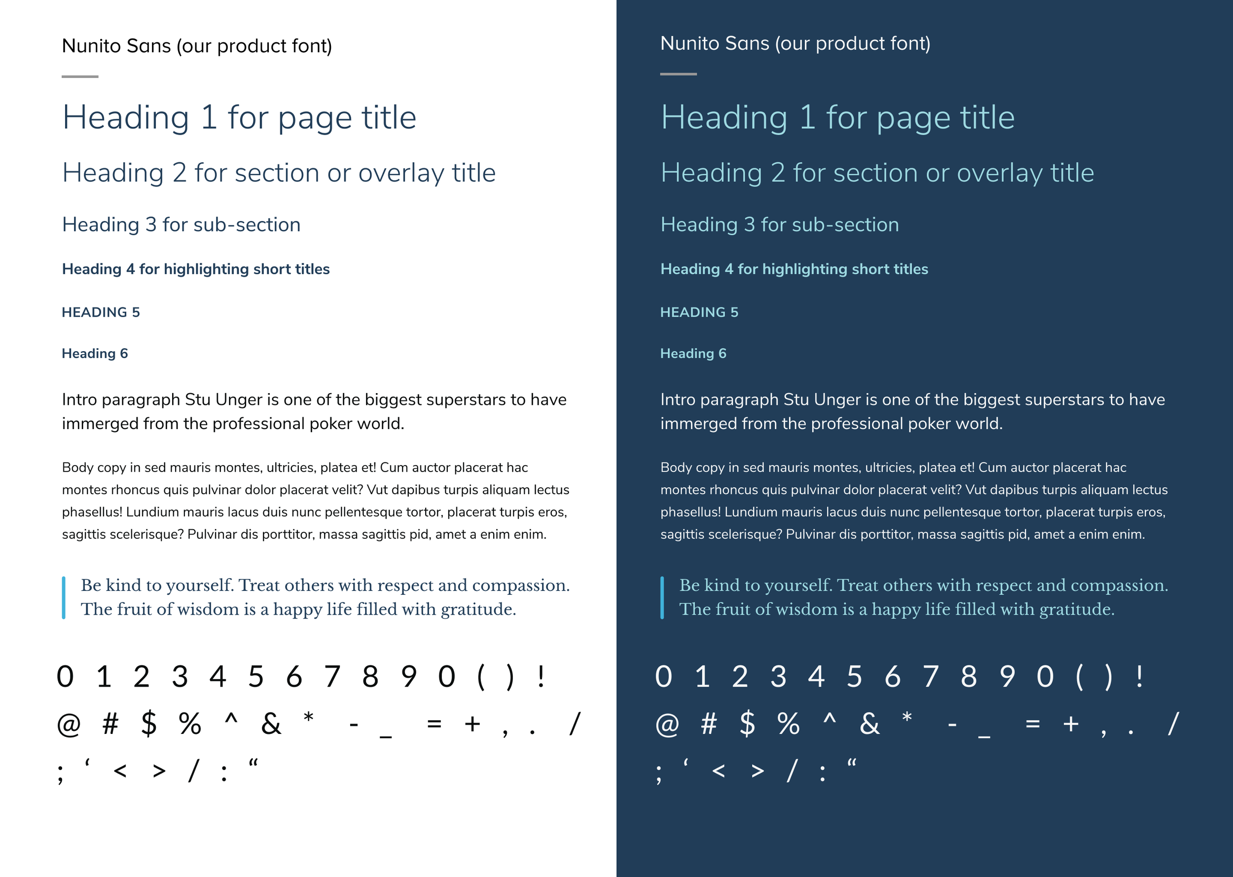
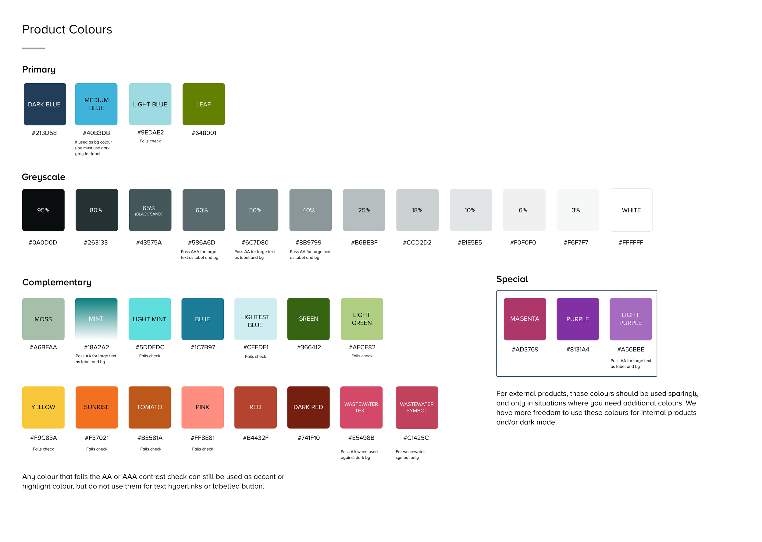
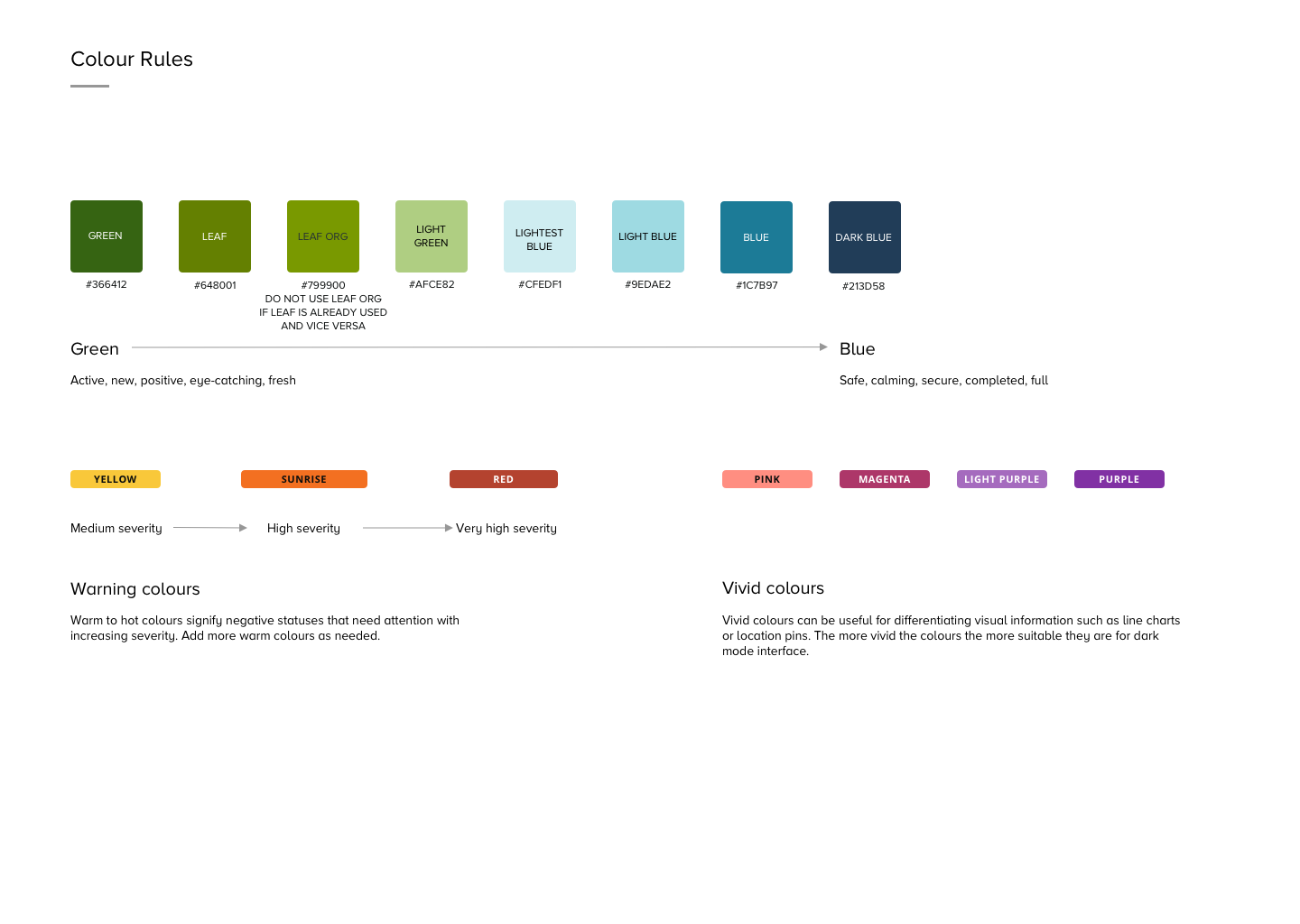
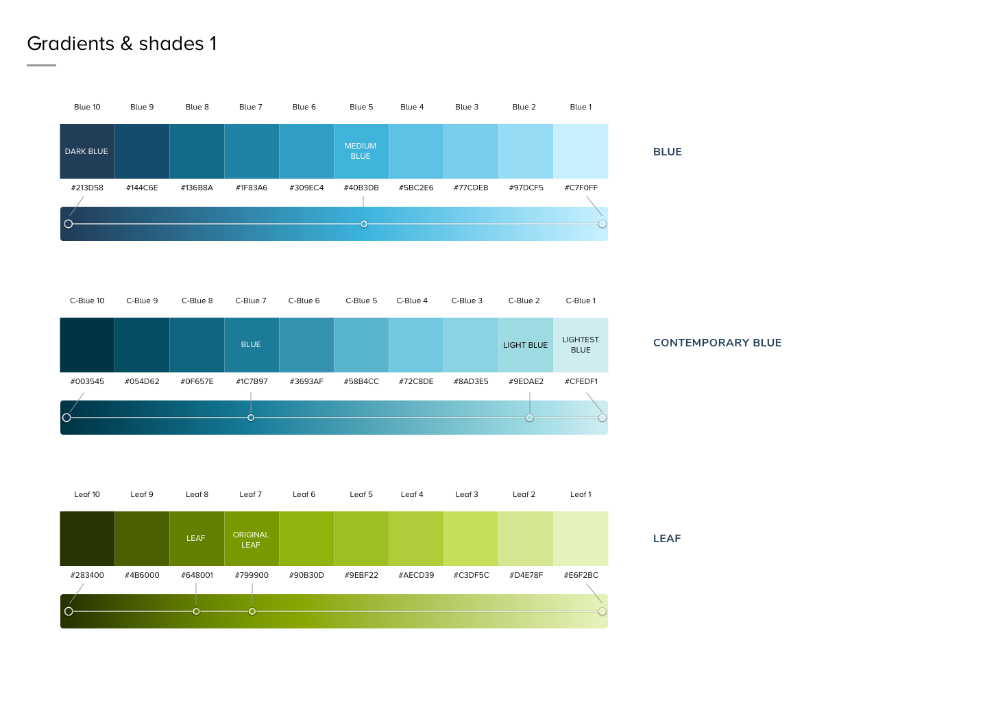
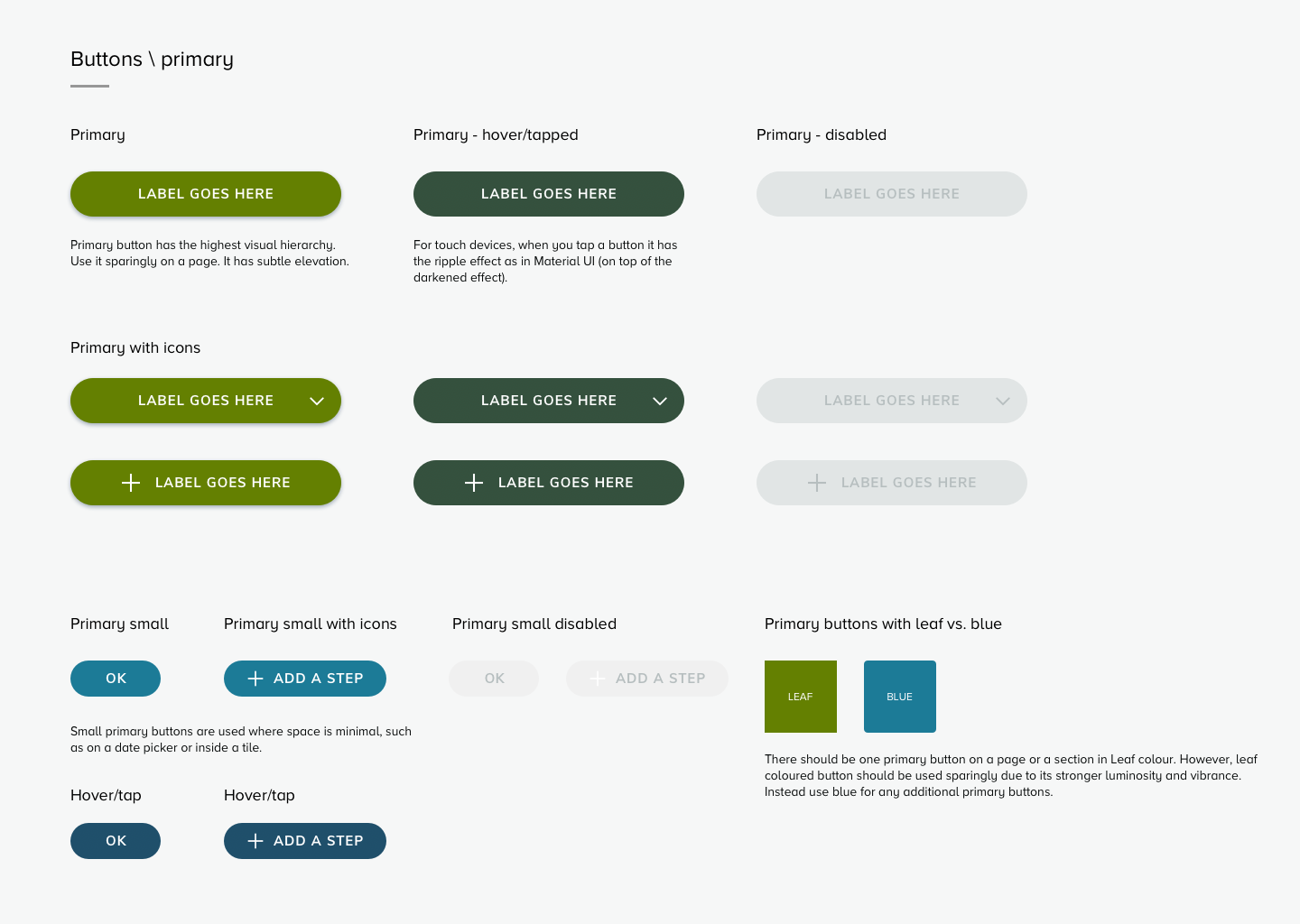
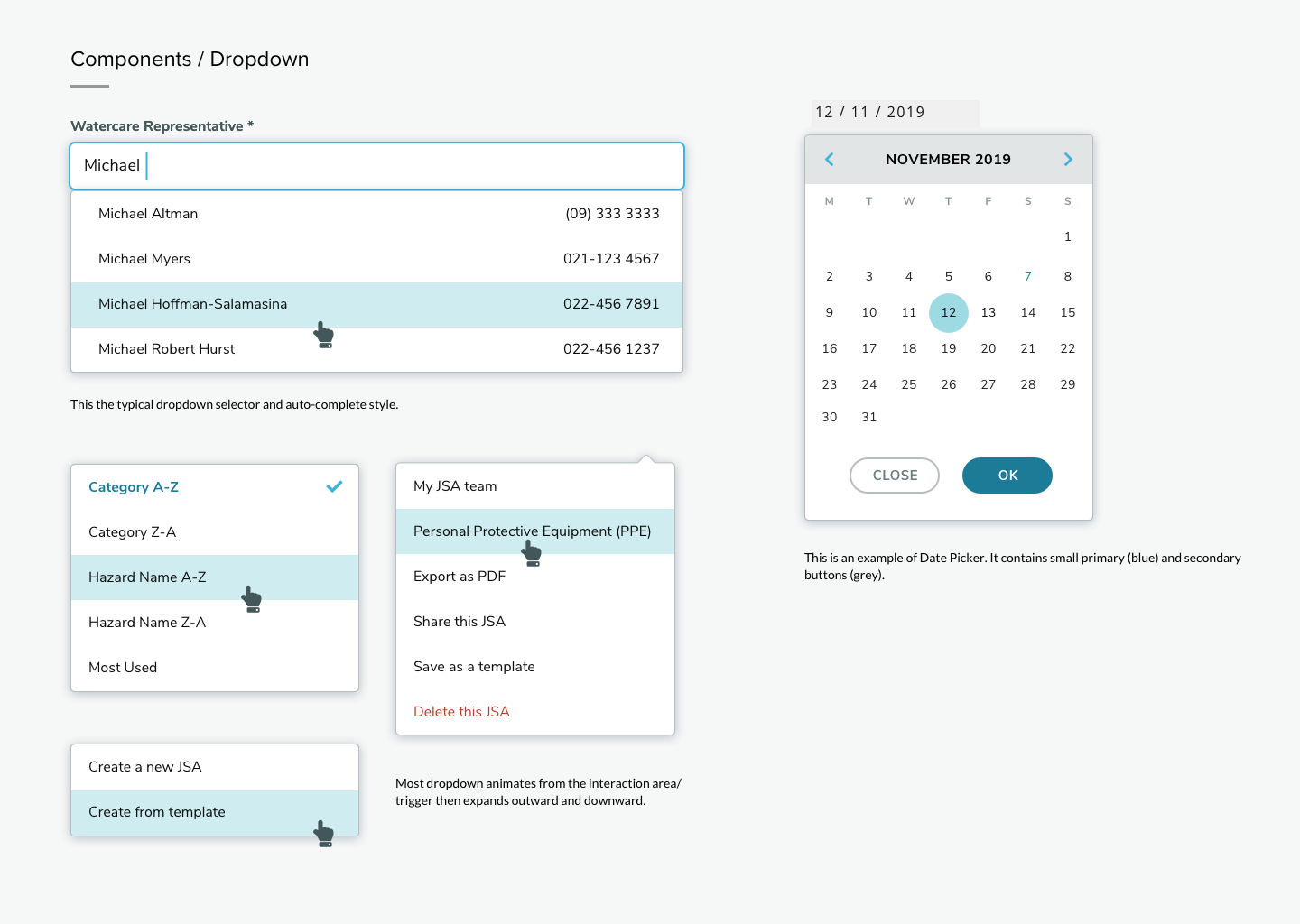
The information design should be clear for the general public, while presenting up-to-date statistics for the scientific audience. I worked iteratively with the web development team to make the new UI components reusable, scalable and integrated into the Watercare Design System >
After the first section was launched, the project was de-prioritised over more urgent matters: Watercare’s Covid-19 response and the looming Three Waters Reform, so the rest of the sections were postponed.


