nerve centre digital design
Designing key digital products for Watercare’s Nerve Centre – the new mission control room where operations and customer teams can collaborate to manage and mitigate water utility incidents across Auckland, so customers can have efficient resolutions and future trends can be predicted.
Client: Watercare (Digital)
Roles: user research / design strategy / co-design / prototype / user testing / interaction & UI design / design system
how the nerve centre came to be
Watercare continuously strives to improve the efficiency of its customer faults' response, and in 2018 they identified key business challenges such as siloed & reactive teams, ageing infrastructure and water supply & networks that struggle to cope with demands.
Furthermore, environmental disasters like the Tasman Tempest (Mar 2017) and the prediction of a once-in-a-century drought (2019-2021) highlighted the needs for better resilience in responding to critical climate and infrastructure incidents at Watercare.
Against this backdrop, the previous leadership team came up with the idea of building a space that would enable new ways of working to resolve the above issues, called the ‘Nerve Centre’:
“(The Nerve Centre) is a place we can go to solve problems quickly for our customers using input from all areas of Watercare. An Ops Centre on steroids that knows the customer.”
– Raveen Jaduram, CEO (2018)
~ Part 1: Discovery ~
filling in the knowledge gap
At the start of this project I had so many questions: What makes up a water utility control room? Where is it located? How is it used and by whom? Because the knowledge base was scattered throughout the organisation, I employed several research methods to quickly fill in that gap. I timeboxed the efforts to 2 weeks (across 3 sprints) to meet with the original deadline of three months.
Co-Design Workshop as an entry point
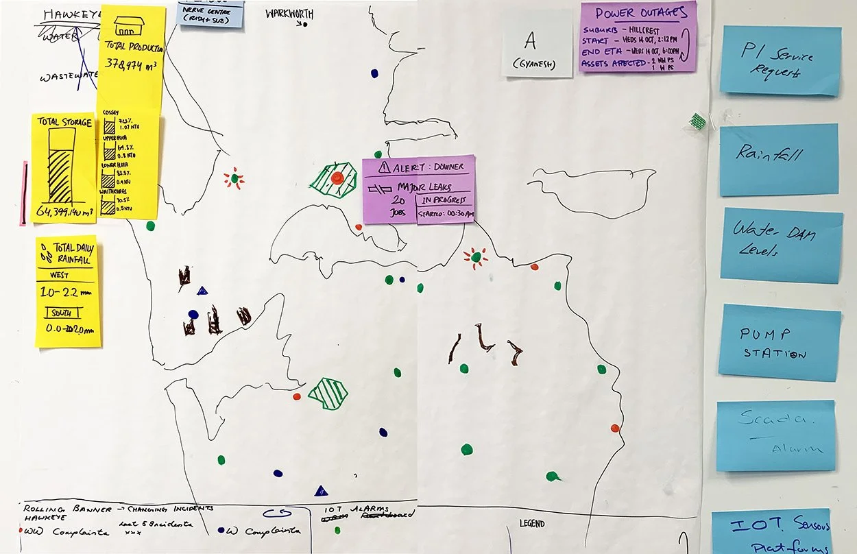
We brought forward the co-design workshop early in the Discovery phase to tease out the product vision, onboard and inspire the product team. It was a fun way to engage the Subject Matter Experts (SMEs) and provided the Product Owner (PO) with materials for the Big Room Planning.
The Co-Design Brief: “Design a digital experience that visualises critical maintenance works with relevant geospatial information across Auckland, so users can work more efficiently and customers have better response experiences. This will fill in the central portion of the Nerve Centre's wall screens.”
Out of this co-design session we had a features list, design concepts and new data sets that we could explore further (ie. power outage, traffic info, teams, etc.). The team got excited and we had a list of actionable tasks.
User groups & Problem Statement
By interviewing SMEs, Control Room (CR) Operators and business stakeholders, I initially identified three user groups who would be using the Central Overview Screen (CS):
Primary: NC Operators – a new role that combines the Transmission & Network operators’ duties.
Secondary: Maintenance Planner and Customer Faults staff.
Tertiary: Walk-in Managers and Support Teams sitting outside of the Nerve Centre.
Due to time constraint the business agreed to focus only on two user personas in the primary group: NC Operators and Operations Controller.
Key problem statement:
“NC Operators don’t have a consolidated visual overview of all the critical transmission vs network activities, teams, alerts and geospatial information. This makes it hard to predict, plan, resolve or understand how incidents might impact key customers and assets, so managing the response to a customer’s incident is inefficient and cumbersome.”
field study findings
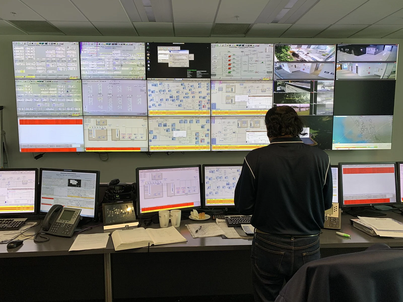
As the Nerve Centre would be a physical space, it was important for me to study the existing Control Room at Watercare to gain insights into how CR Operators worked and their pain points in context of the environment.
Key findings
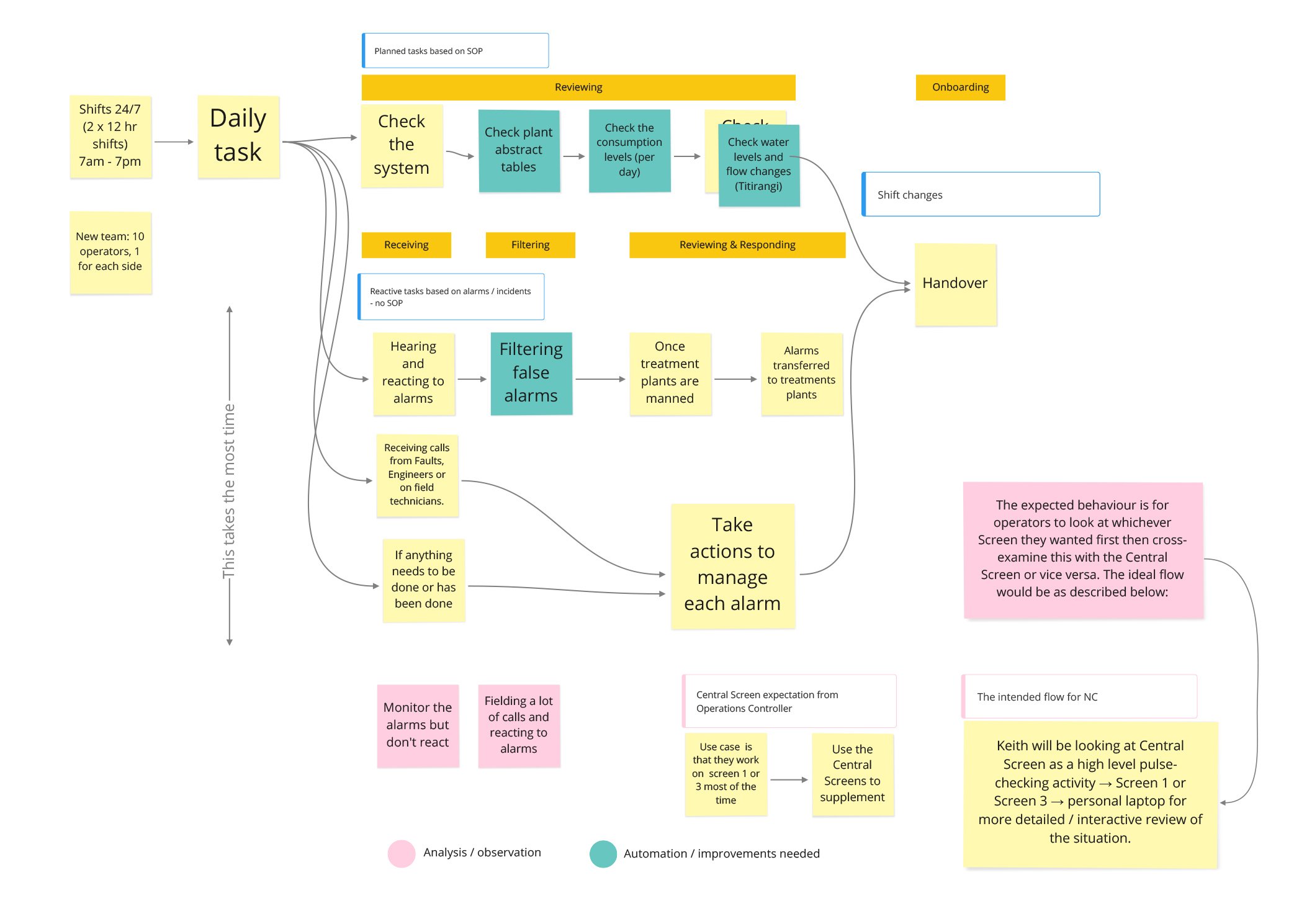
• Alarm fatigue was real and pervasive amongst operators, made harder by manual business processes.
• SCADA, iFix & CCTV wall screens were not readable nor used by the operators.
• Other insights such as the typical operator’s workflow and behaviours, which revealed design opportunities.
desk & secondary research insights
What are the business outcomes? Is there a product roadmap? How do we know if we are successful?
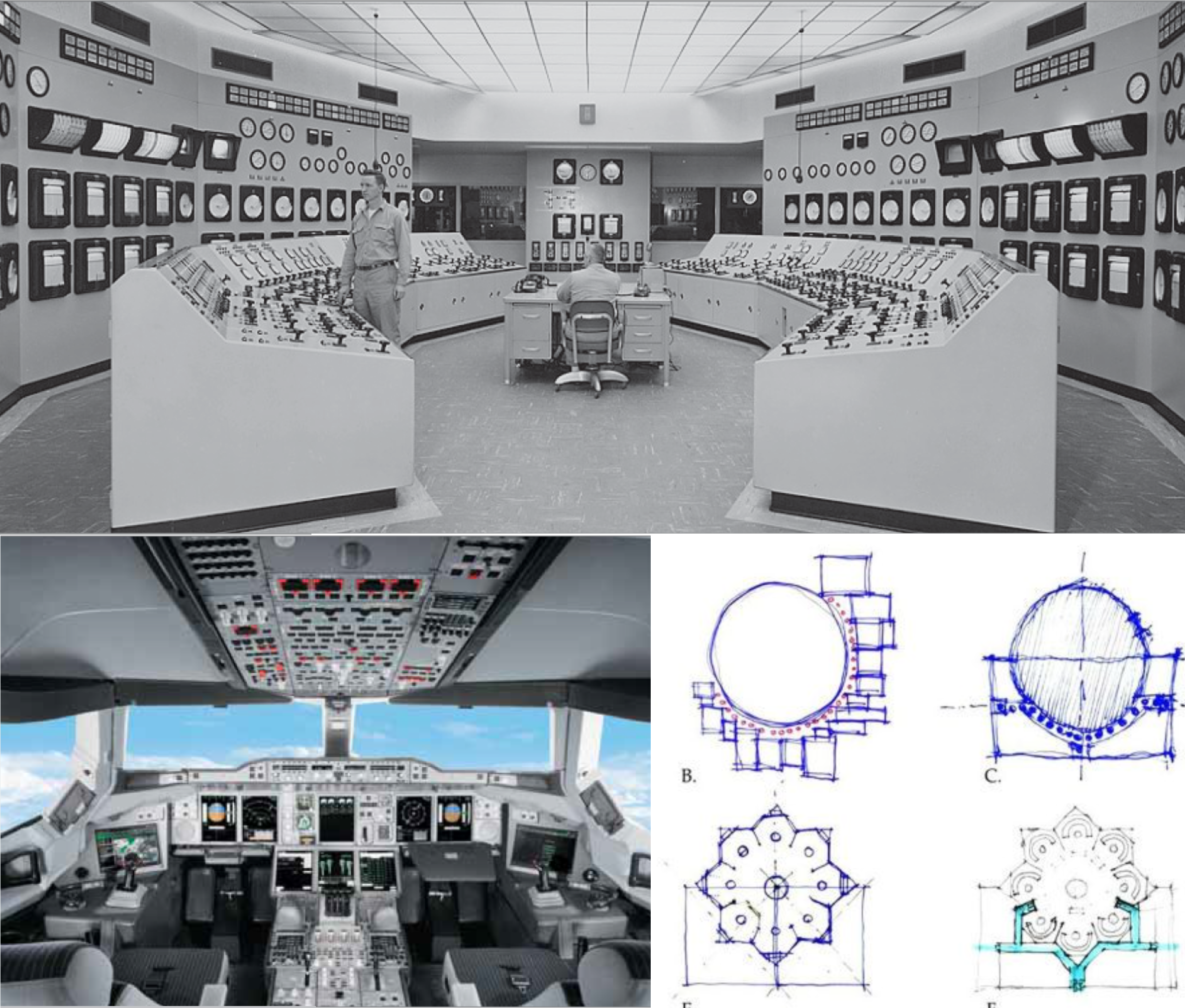
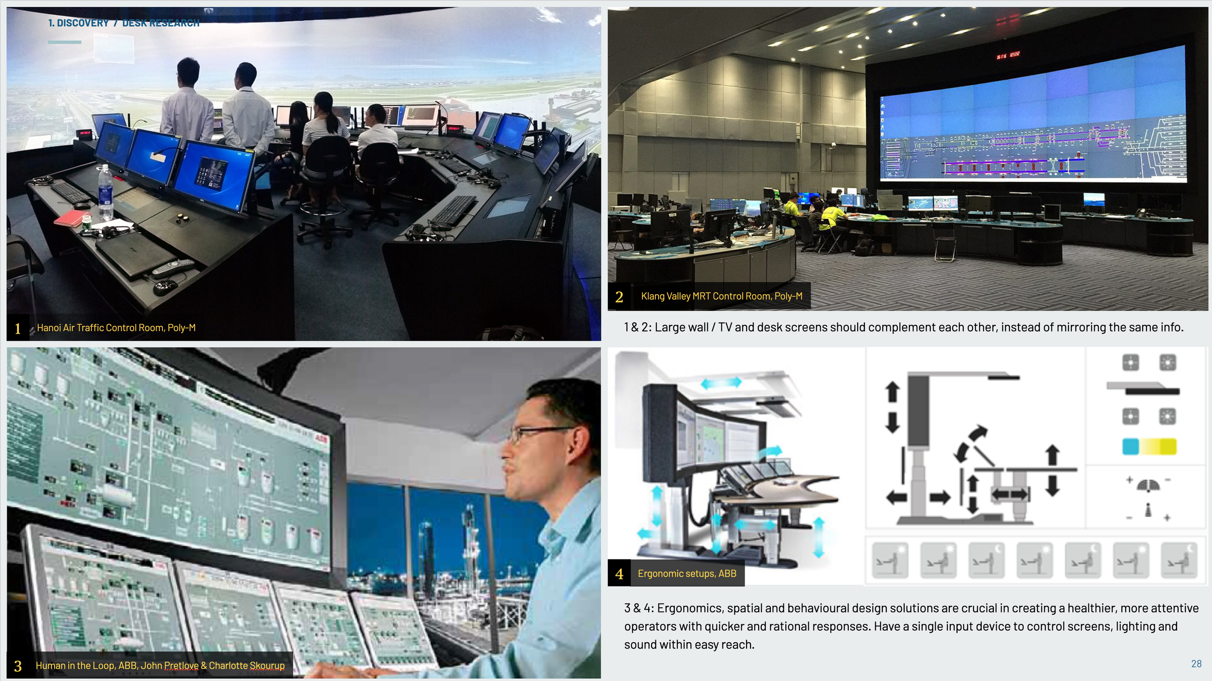
I leveraged extensive secondary and desk research to quickly understand the project’s background, business goals and learning about best design practices for control rooms.
Keeping humans in the loop
It is important that the human operator remains at the centre of it all – from the time the Control Room is designed to how it is built and run.
Other key research insights:
Use the wall screen to complement, rather than mirror the desktop view.
Alarm fatigue is a common global problem, and must be resolved as part of the solution.
“The more reliable and greater scope of automation, the greater the demand on the operator when it fails.”
– John Pretlove, ABB Strategic R&D Group, Norway
~ Part 2: Definition ~
adapting to changing scopes
As part of the Definition phase, I helped the team with:
Prioritising the experience and features that we should build.
Finalising the primary user personas and defining the design strategy.
Discussing project risks, future vision vs MVP, design scoping and others.


Delays in building the Nerve Centre space, due to the global logistic disruption in 2020/21, extended the project’s timeframe from 3 to 6 months. We took this opportunity to refine the core Central Screen user experience, but was also tasked to deliver additional digital products: Fleet TV, Activity Tracker 2.0 and others.
~ Part 3: Design ~
central overview screen
In the design phase I created six design principles that incorporated key Nerve Centre attributes. Then I looked for visual design inspiration by benchmarking interface design from Sci-Fi shows to dark mode UI examples. As a team we agreed to continue using the Dark Mode theme which had already been used in other existing NC products.
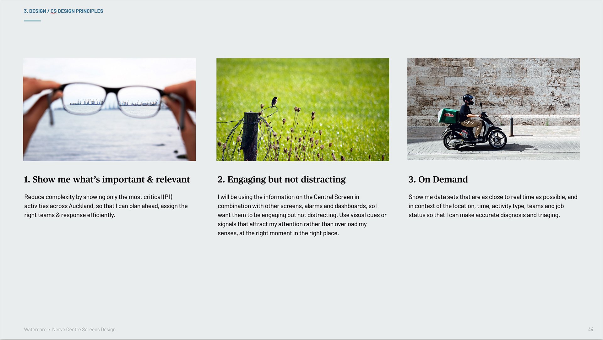
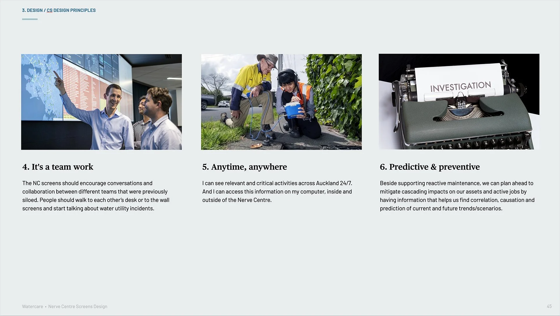


Afterwards, I started designing the Central Screen (CS) concepts from lo-fi to hi-fi while engaging the product team and SMEs throughout each iteration. Technical review & data integration were also crucial in shaping what was feasible with the interface design. So I worked closely with analysts, developers and testers.
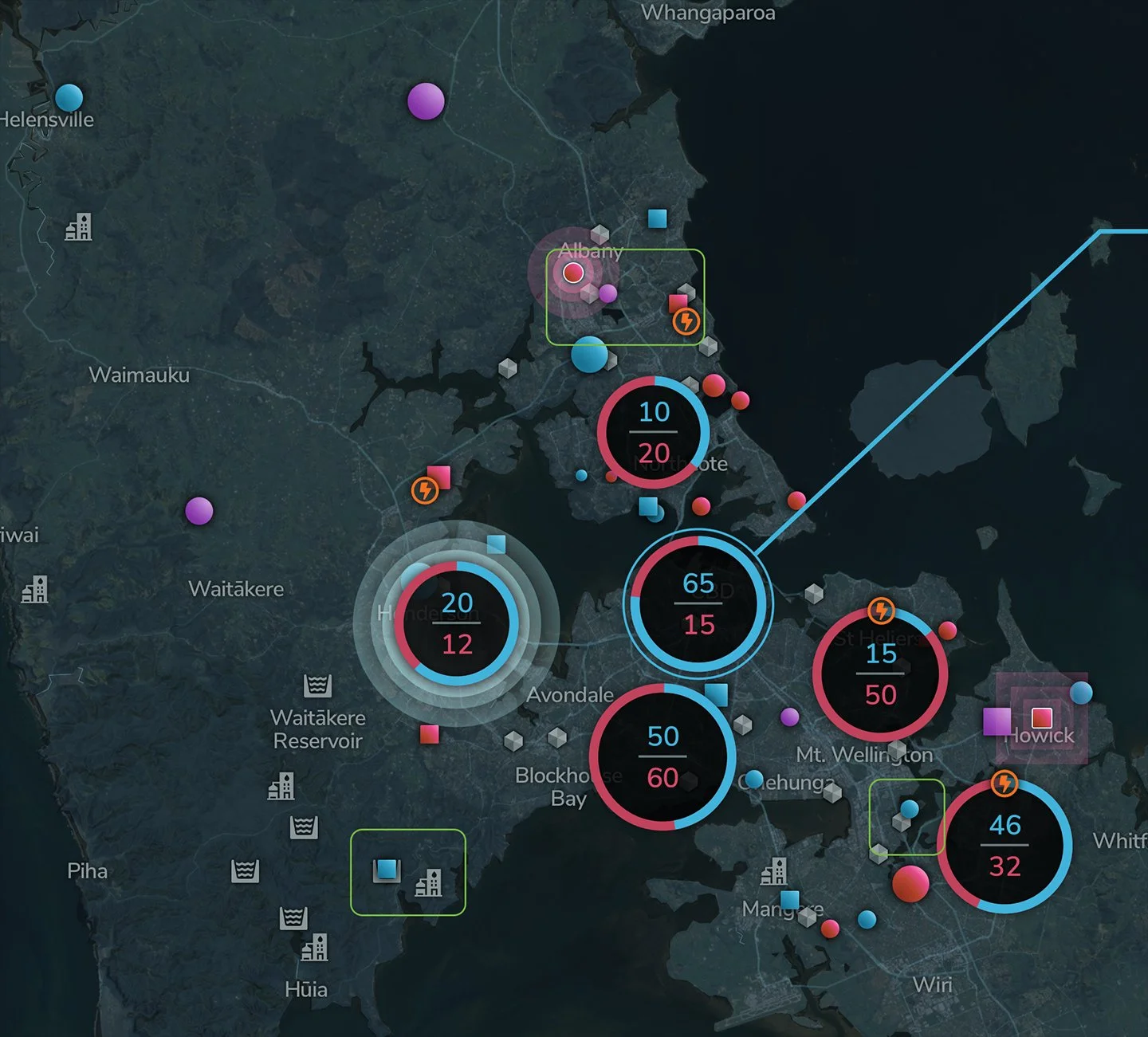
Since the Central Screen was not interactive, I made sure that vital information were presented timely and distinctively so that the operators could easily find a correlation between a critical (P1) activity, geospatial and relevant information. This includes but is not limited to:
Showing Activity Details info cards with data that is specific to the activity type (ie. affected assets vs Onsite KPI).
Using iconography and colour coding to differentiate the activity type (ie. transmission vs. network, water vs. wastewater).
Displaying statistic cards for activity counts, dam storage levels, weather forecast, and others.
Key elements that we needed to validate was information density, hierarchy, activity types, art direction and how the users would respond to power outage information, statistic cards and the news banner.
user testing at the hub
By using TV screens at The Hub as proxies for the Central Screen I was able to study how distance & viewing angles affected readability prior to user testing. Key findings included where the TV bevels would cut into text/images, the optimum colour contrast and seating position for the best viewing experience for Operators.


I facilitated a Design Review & Pilot Test with the SMEs first to make sure all key information were included in the design, and they were happy with the overall art direction. Then I conducted task-based user testing with six participants who represented the user groups. The UT results helped us determine the best default zoom level, validated how crucial power outage visualisation was and that news banner was not necessary.
negotiating for a better real estate
Based on user research and test results, we managed to convince the business stakeholders to give us additional vertical real estate so that users can view the entire Auckland region in a more comfortable size.
Changing from 4 to 6 TVs layout allowed me to scale the map up and provided a clearer view of the activity and asset icons. The statistic cards were moved to the top so more staff could see them from afar, and the news banner was eventually removed from the MVP.
prototyping the nc space
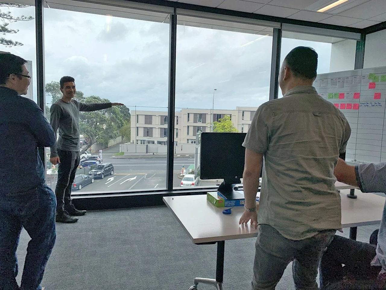
Because there were interior design issues that reduced the Central Screen’s visibility and we still had no access to the physical Nerve Centre, I decided to prototype the NC space with the team.
Outcomes from the spatial prototype:
The optimum distance from the wall screen to the front desk is 3-5m.
We chose a layout that provides the most visibility of vital information, with the middle desk removed.
These findings were communicated to the architecture firm, resulting in a revised floorplan and screens layout.
To keep the business stakeholders engaged, we presented our progress in Sprint Reviews and Mid-Cycle Showcase, while making sure relevant feedback were incorporated into the next iteration.
~ Part 4: Build ~
on-site design and development
On the 9th March 2021, we finally had access to the newly built Nerve Centre. Being in the actual physical space allowed us to work more efficiently and with better precision than before.
~ Part 5: Measurement & Next Steps ~
measuring ux & beyond
The Nerve Centre digital experience requires time to measure and these were my recommendations for the team:
A SUS benchmark at the beginning of the project with 3-month follow ups.
To conduct user interviews with Operations and NC Controllers as part of their Friday stand-ups.
Any experience optimisation and UI components in Activity Tracker 2.0 should be designed so they could be rolled back into the Central Screen and Fleet TV easily.
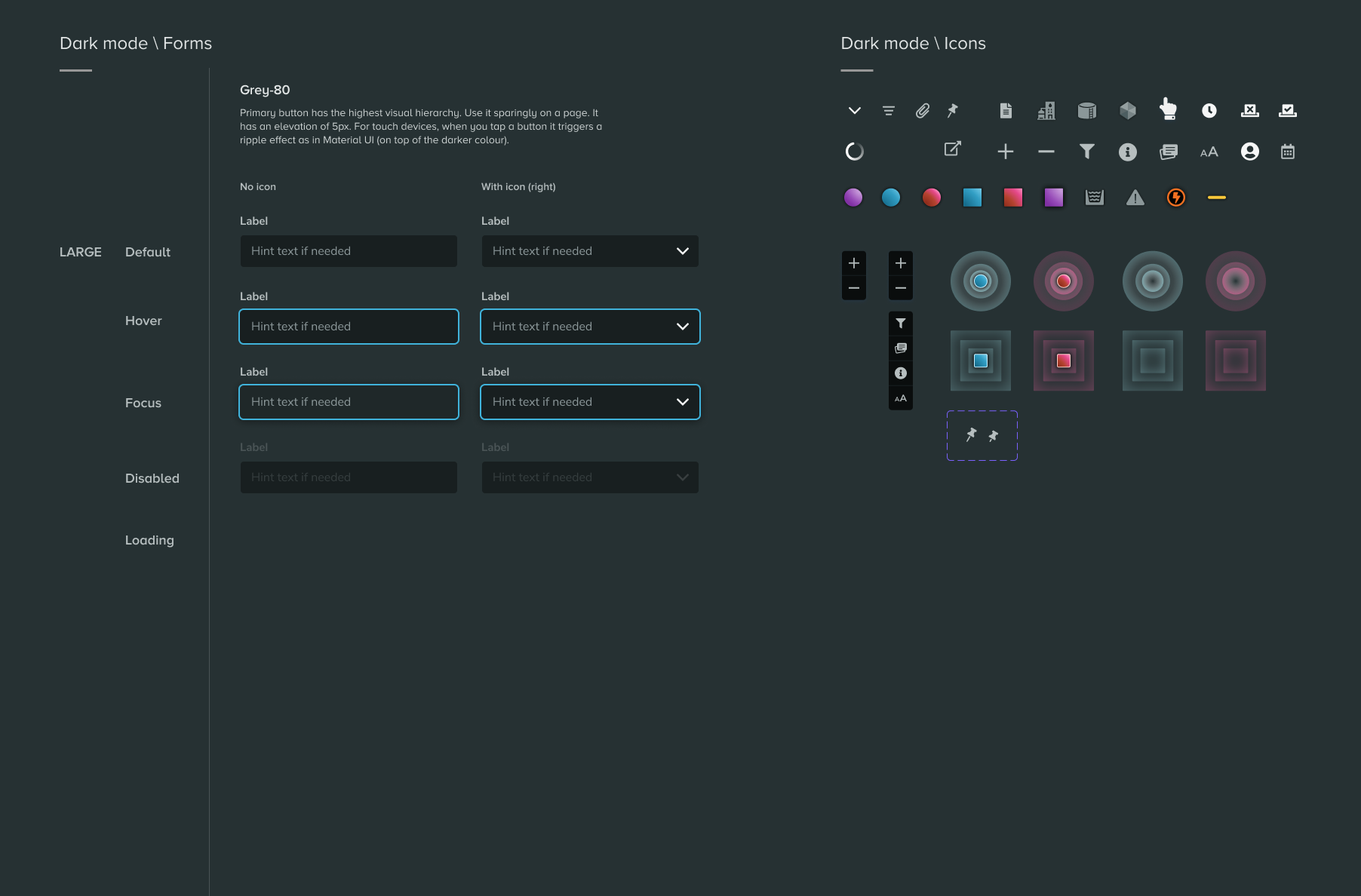
To update and expand the Watercare Design System with new dark mode patterns.
The video below shows a work-in-progress of the Central Screen that includes the power outage card in its own cycle. Note that the activity icons and clusters were temporarily turned off in the test.
other nc digital products
Discover other digital products I got to design next for the Nerve Centre in the second part of this story.


